iOrderFoods
Online Ordering Web App
UI UX Improvement
Responsibilities
User Flow Redesign
User Interface Design
Prototyping & Testing
Team
2 Designers
3 Developers
1 Product manager
iOrderfoods is an online ordering feature web app
for small business restaurants
Problems
Not optimized on mobile devices
Complex and confusing online order process
Goals
Redesign the interface for mobile
Build enjoyable and usable online order process
My Role
Lead UX/UI Designer
Problem Statement
The Menu, Login, Cart page are one page. When you select an item and add it to the shopping cart, you cannot check it immediately. You have to scroll down to the bottom to see the cart and continue to pay.
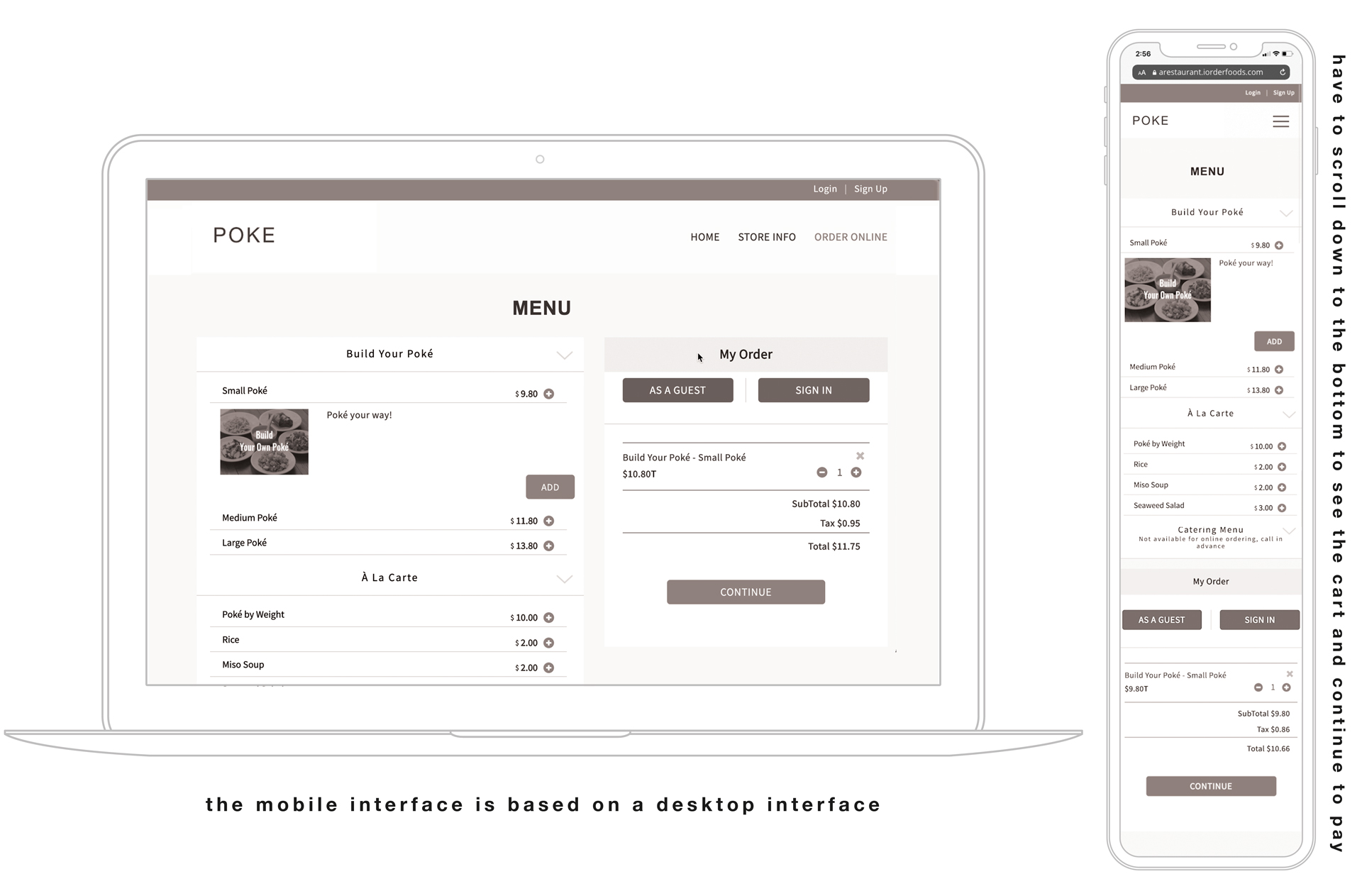
The inconvenience of going through a two-tap process to add an item to the cart.
1) Tap on the menu 2) Add button appears out and you can add menu
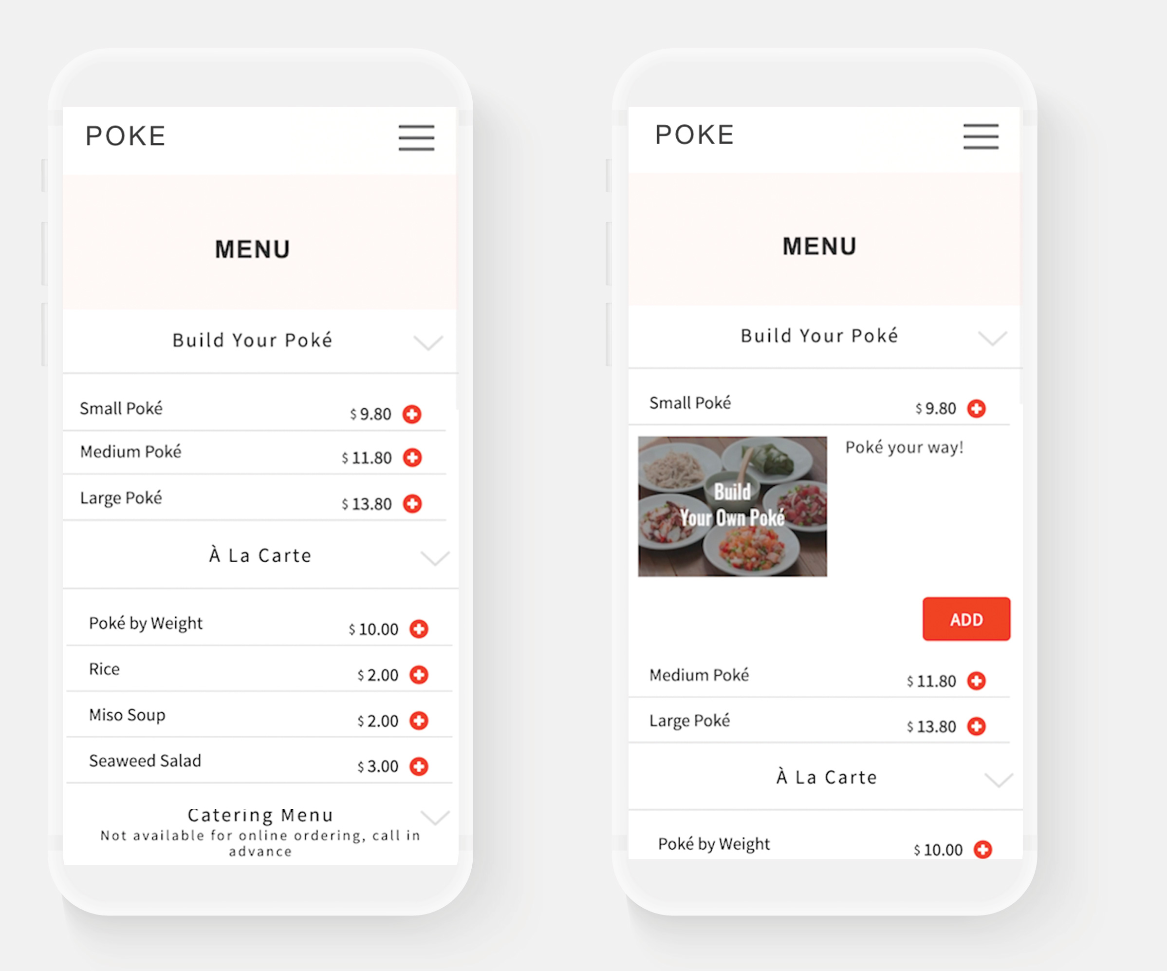
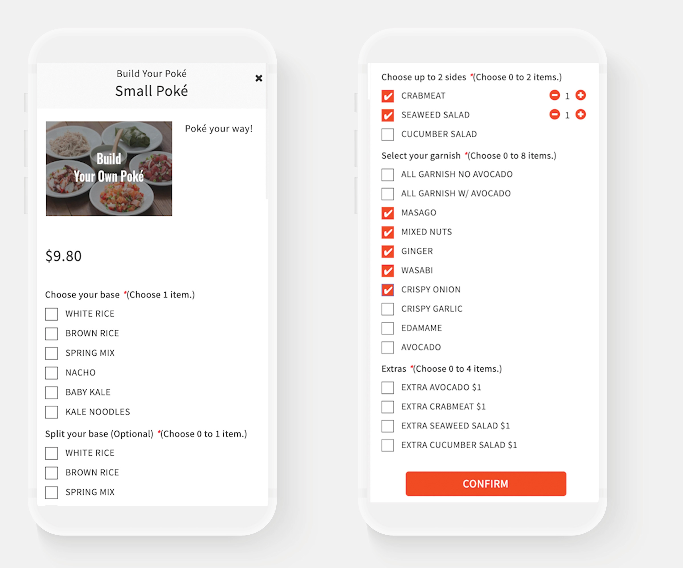
Currently, there is no difference in the size of the title or the style of the selection tool style options, making it inconvenient and confusing to see. Also, no function to receive a comment to receive additional detailed requests from customers, such as food allergies.
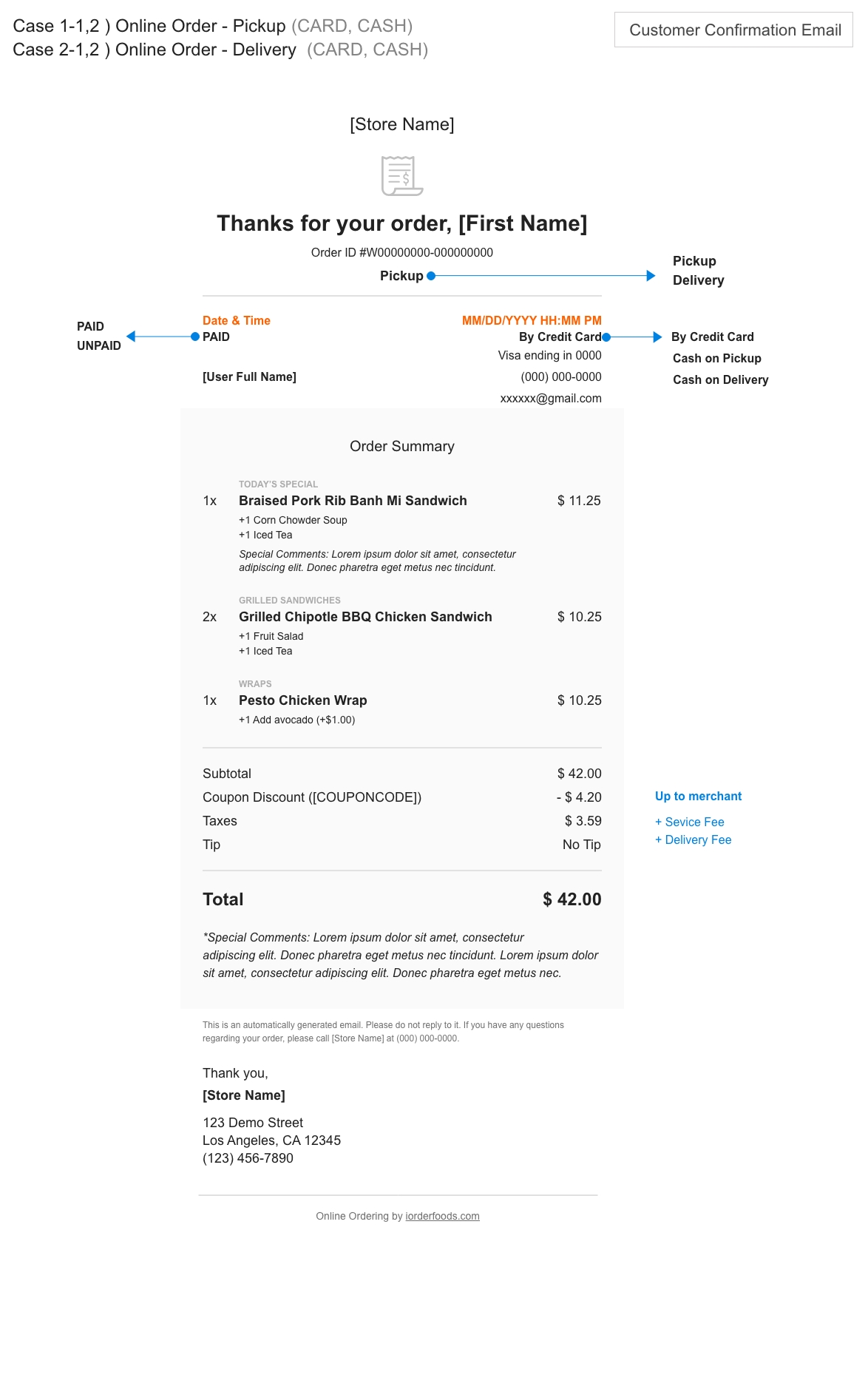
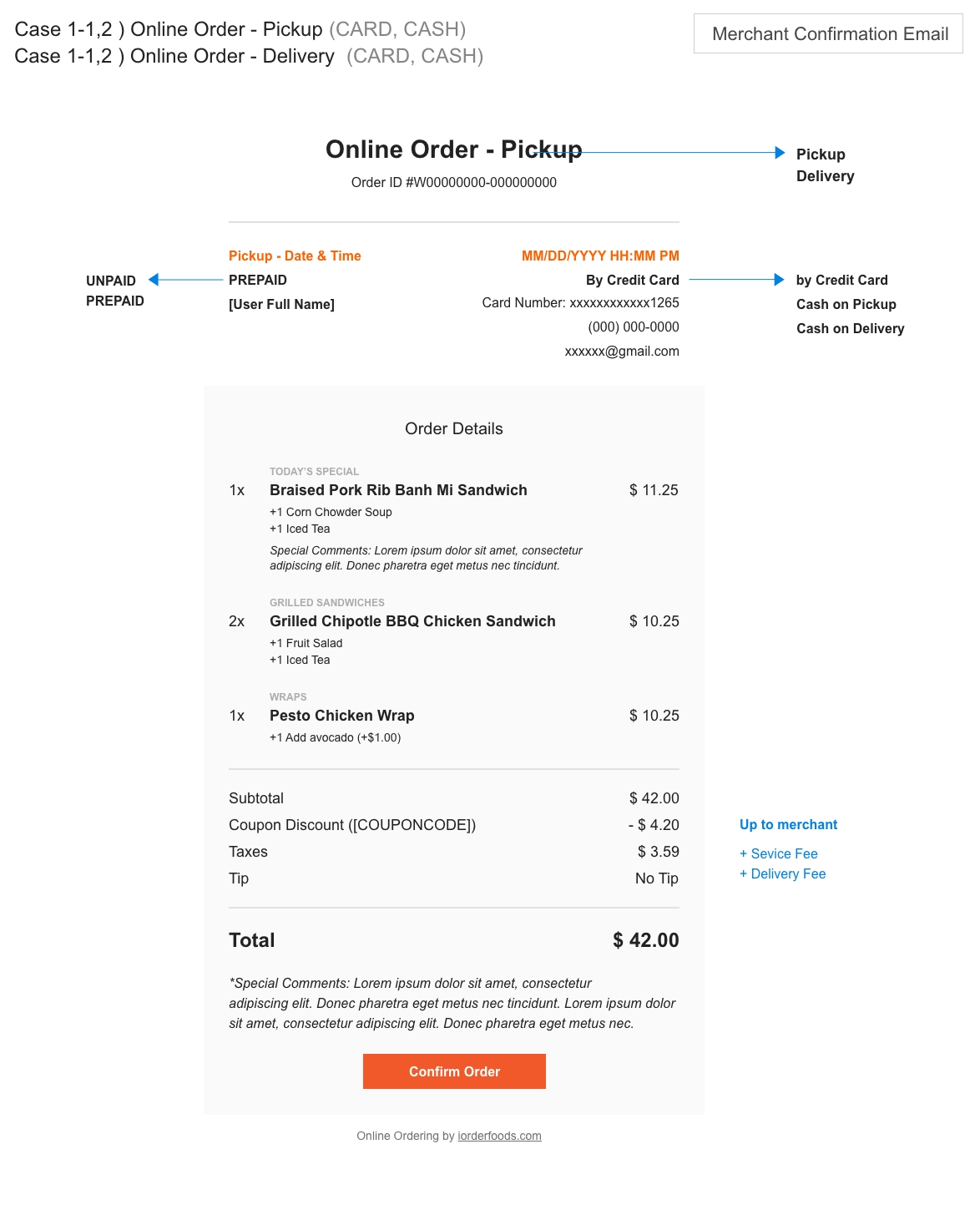
When the order is placed, an Order Confirmation email is sent to the Restaurant Owner and Customer.
The current email confirmation design made it difficult to determine what was ordered and whether it was
Pickup or Delivery.
Order Confirmation_email
Pickup – for Customer
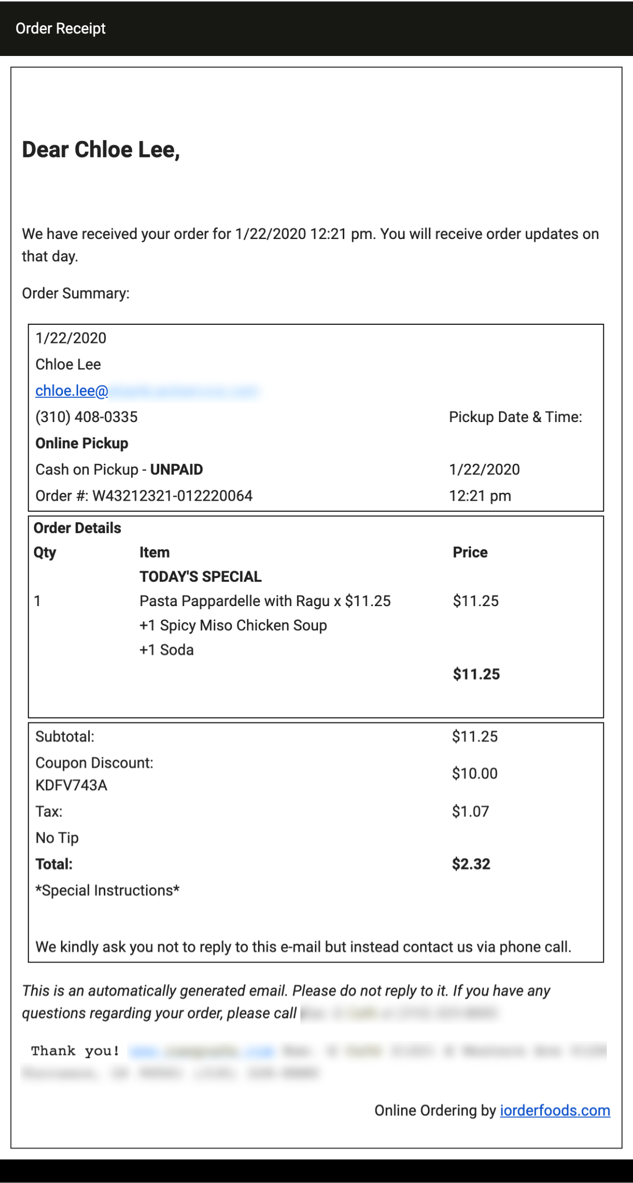
Order Confirmation_email
Delivery – Merchant
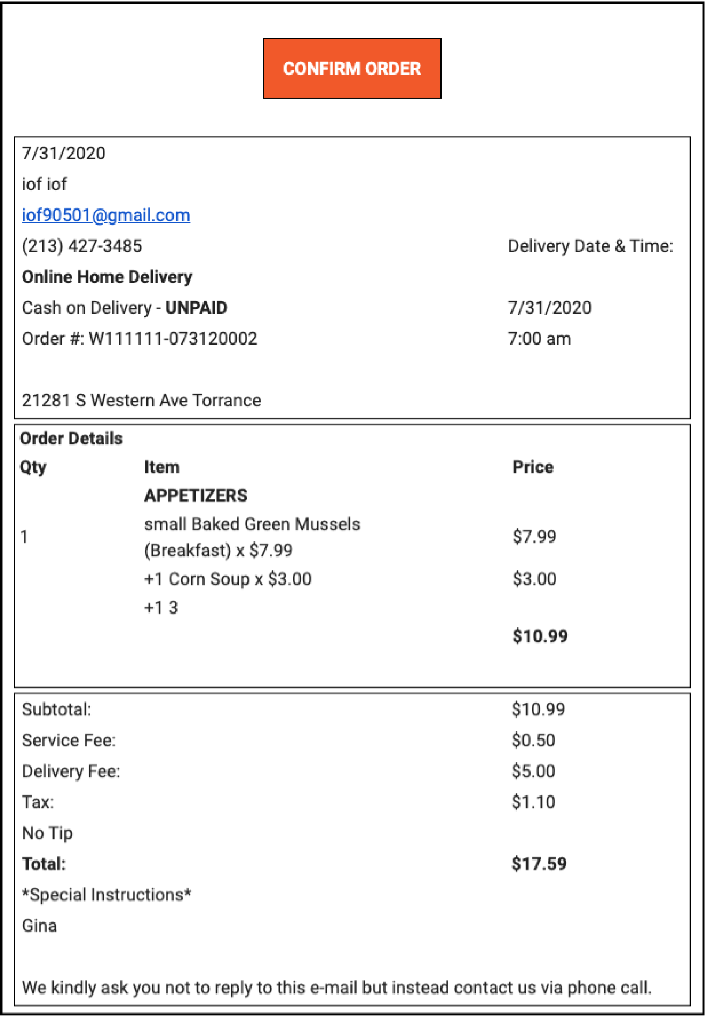
User Interview
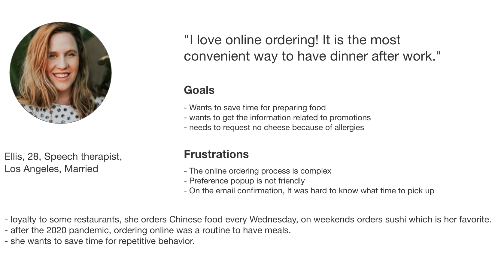
Pain Point
● Unsatisfactory experience of adding items, selecting menu preferences
● Complex payment flow and interfaces
● Disjointed design system
● Complex confirmation email notifications
Solution
● Build an enjoyable and usable online order process
● Make simple payment flow and interfaces
● Create a unified design system
● Redesign confirmation email notifications
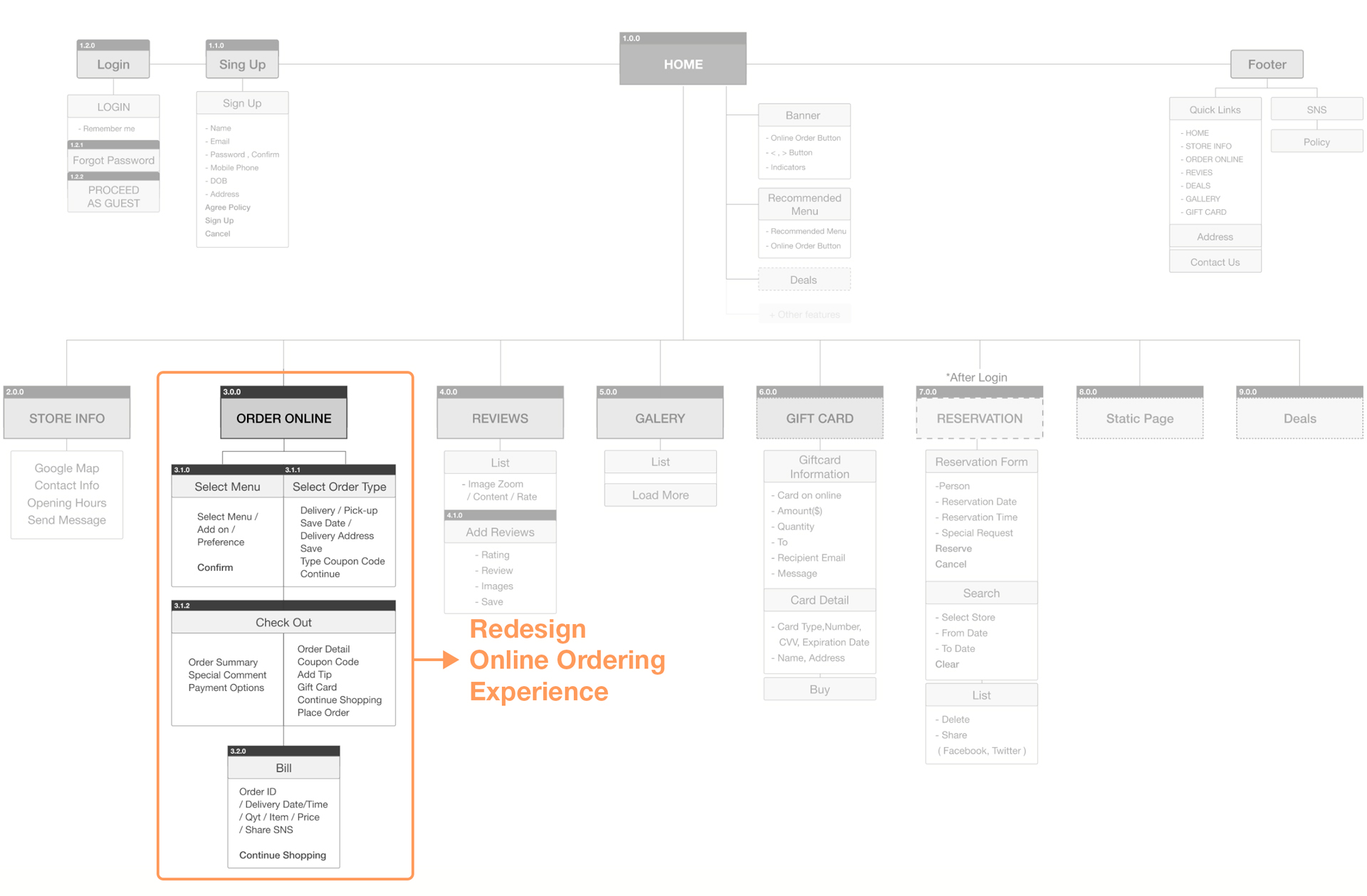
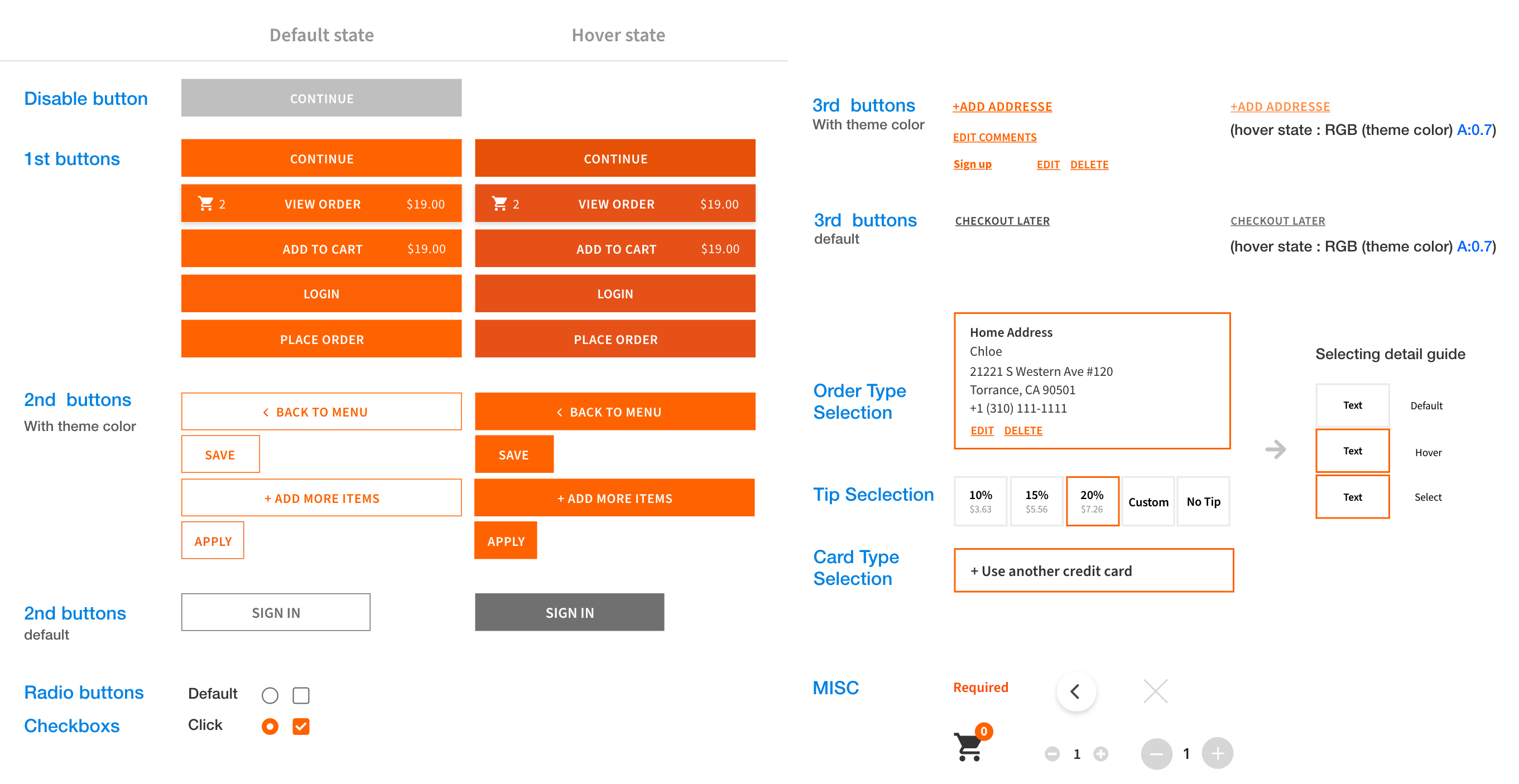
Button Guidelines
Created button styles and guidelines according to importance and applied them to the entire UI.
intuitive Flow
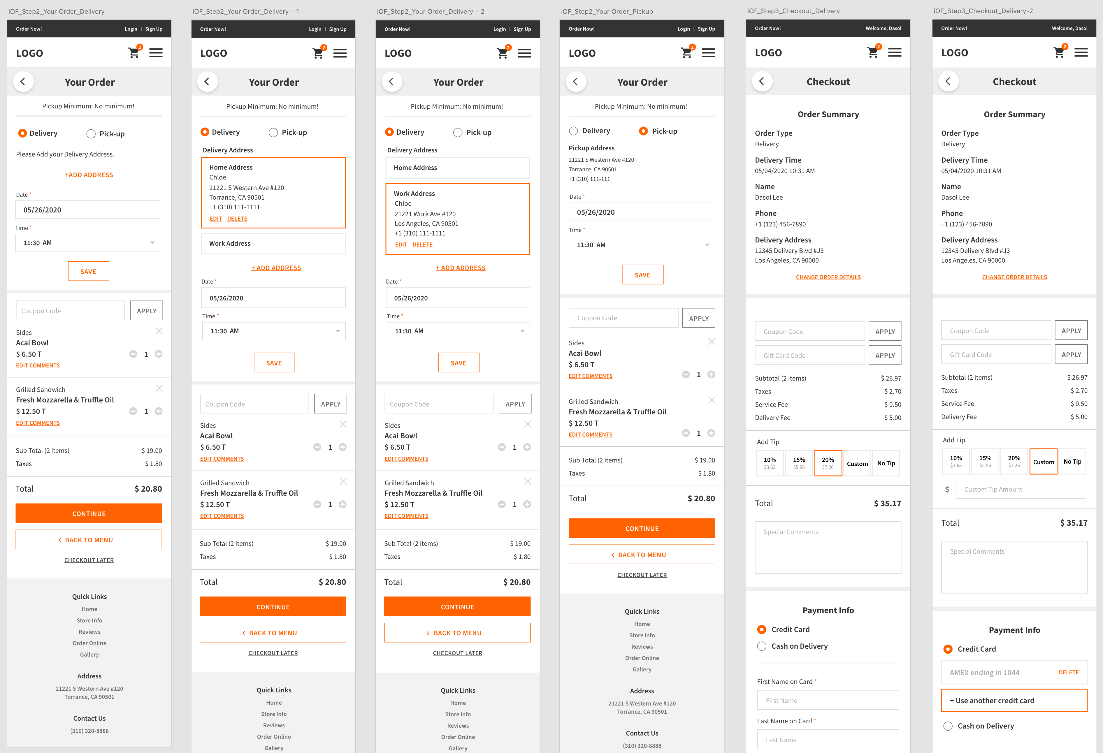
Separated steps to resolve problems that the menu, log-in, my order(cart) page was one page, and you can’t check the menu items you put immediately.


Add a View order button
By adding the [ View Order ] button, we created a path that can move from the menu page to the cart page at any time.
Separate 3 Steps
Menu/ My Order/ Checkout
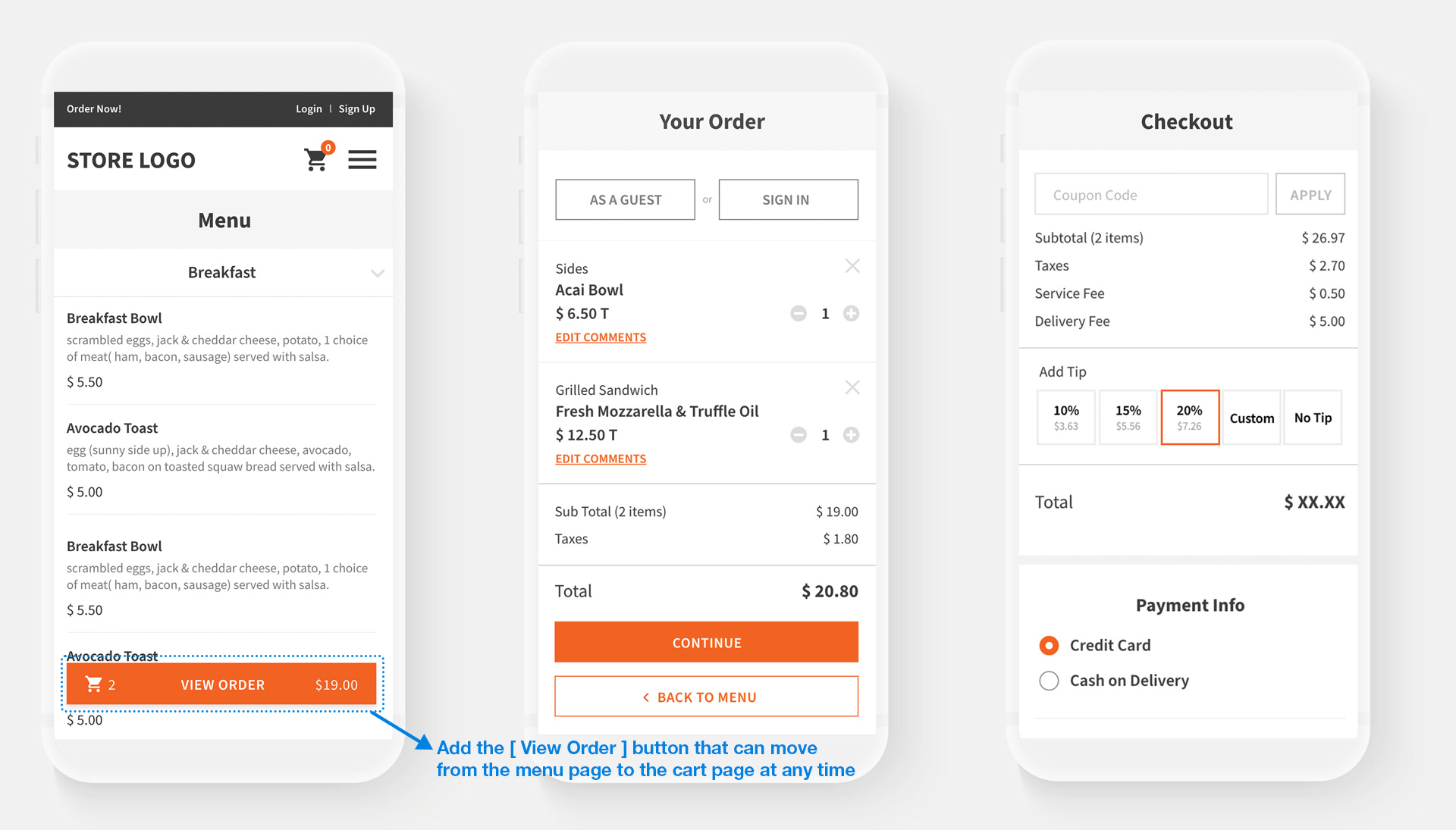
Your order / Checkout page Redesign
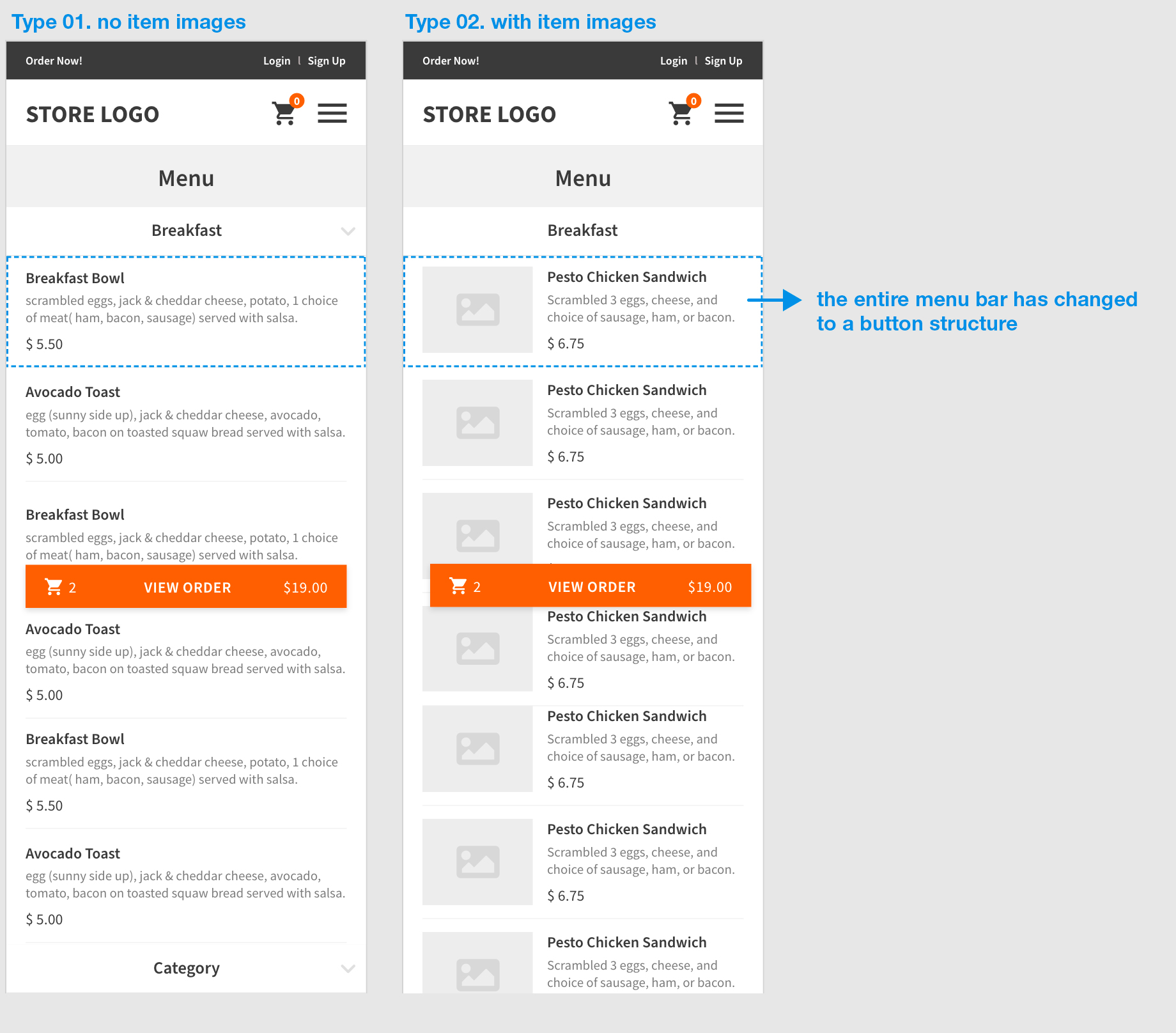
Menu listing Style Redesign
We changed the entire menu bar to a button structure by including a pop-up to choose preferences no matter which menu section is selected.
The problem in the old UI of double-clicking to add menu items was resolved, and the page was changed to a more intuitive design.
Preference Popup redesign
Changed the button and title size according to importance, and made the difference in color.
Also, the current “*Choose 1 item” format was changed to “Required / Optional” so that selection could be made intuitively, and the design was changed to a user-friendly UI.
In addition, by adding the function of Special Comment, we prepared a path to receive additional detailed requests from customers, such as food allergies.

Order Confirmation email redesign
The design was changed to focus on information delivery through the contrast of the design style
and the arrangement according to the theme.
