iOrderFoods
Online Ordering Solution
Mobile UI UX Improvement
Overview
Since the online ordering solution provided by iOrderfoods is a web-based solution, there was a lot of feedbacks that it was inconvenient to use on a mobile screen. So we designed a mobile interface suitable for users who place orders on mobile.
My Role
Service Structure Redesign
User Interface Design
Prototyping & Testing
Team
1 Designer
1 Developer
1 Product manager
The Problem
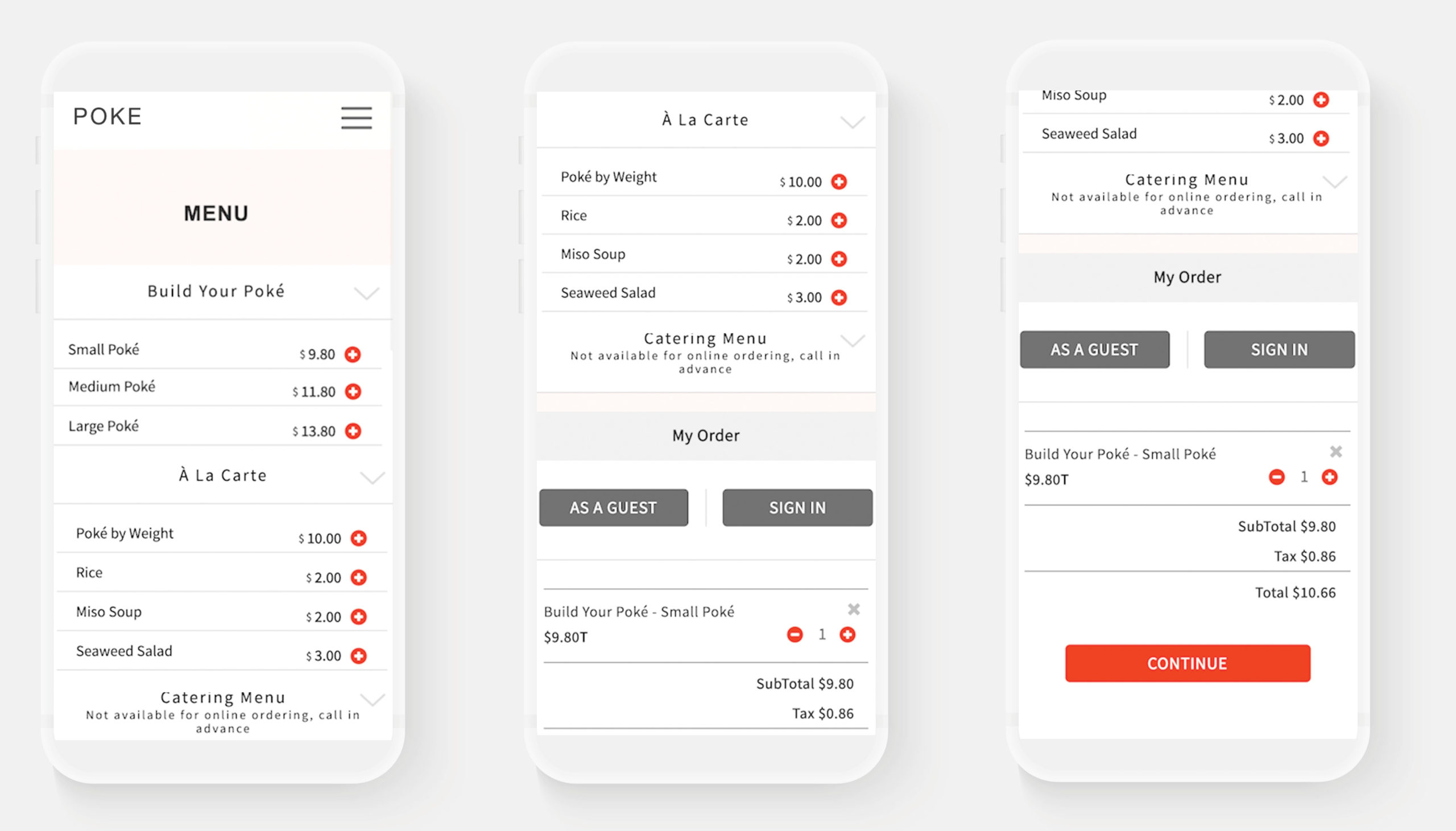
The mobile interface is based on a desktop interface, so it is inconvenient and awkward for consumers to select menus and check shopping carts on mobile.
Problem is the Menu, Login, Cart page are one page.
When you select a menu and add it to the shopping cart, you cannot check it immediately. You have to scroll down to the bottom to see the cart and continue to pay.
Before
Solution
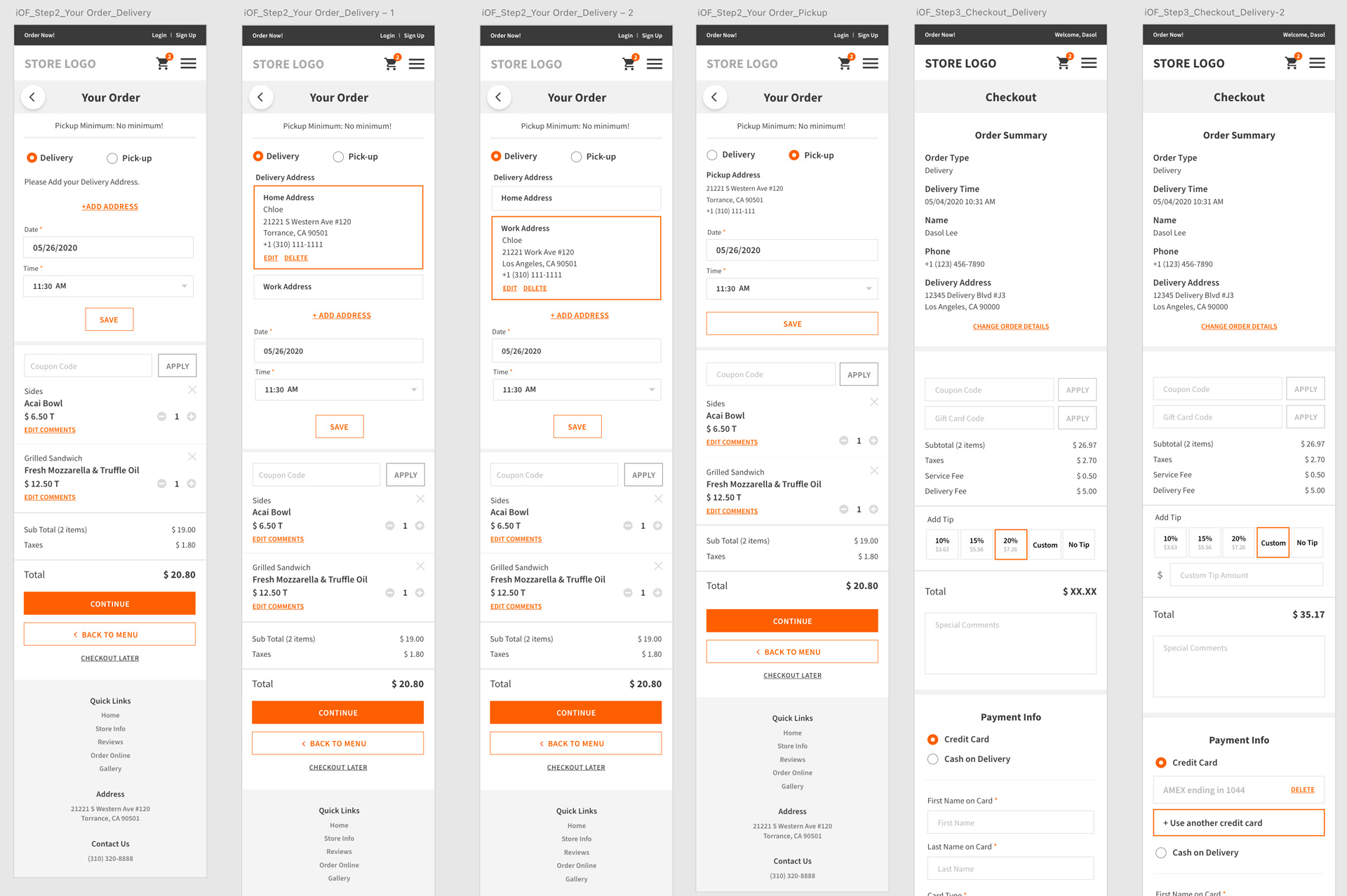
Menu-Your Order-Checkout page is divided into 3 separate steps.
By adding the [View Order] button, I created a path that can be moved from the menu page to the cart page at any time.

after
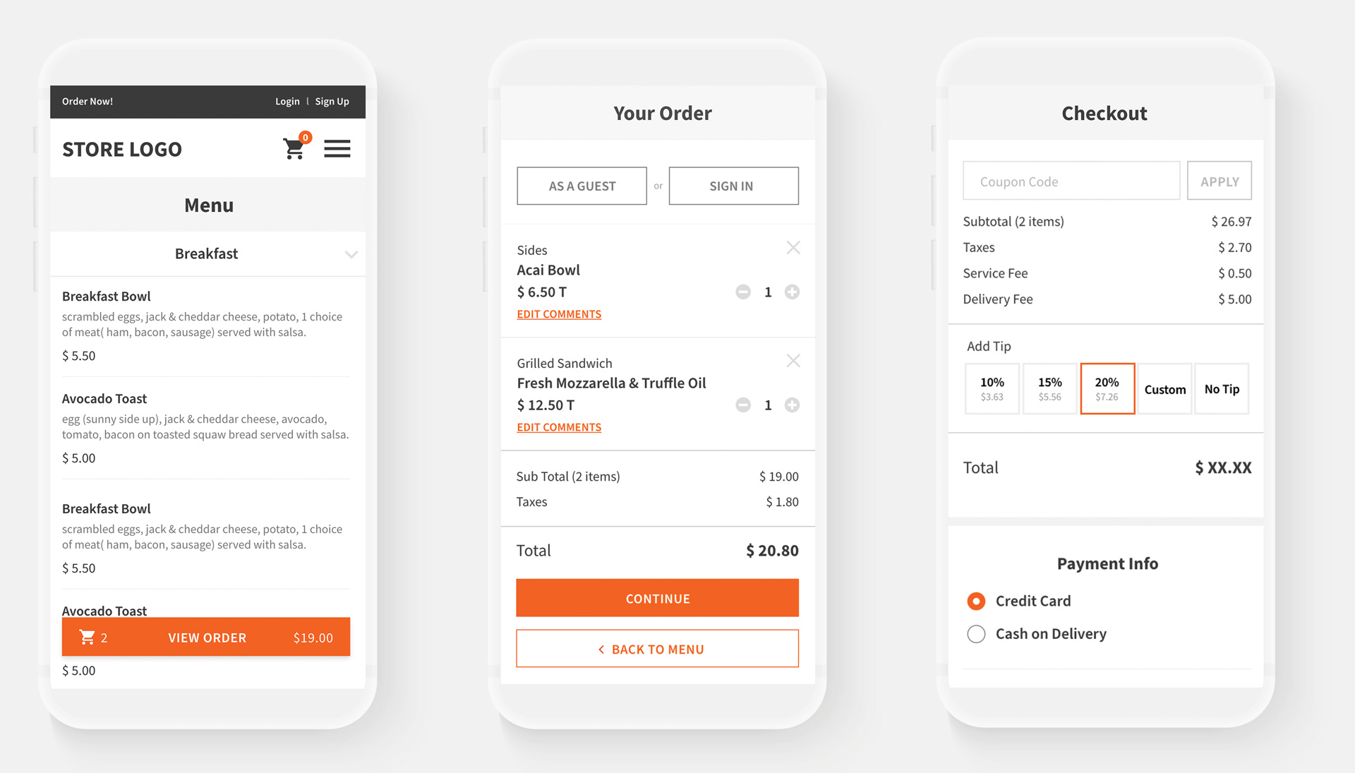
Menu/ Your Order/ Checkout 3 separate steps
Added View Order Button
Your order / Checkout page Redesign
The Problem
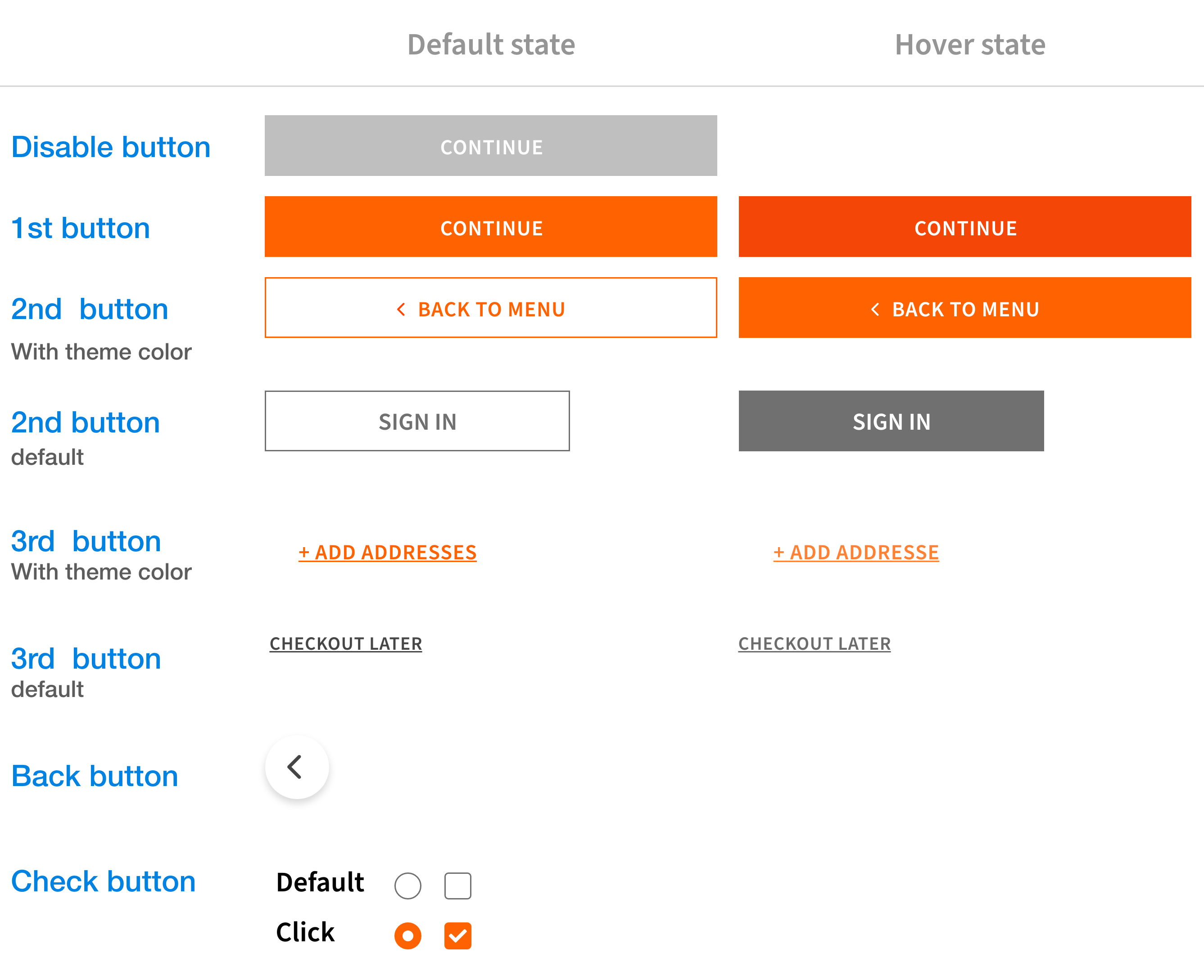
1. UI is not unified and users are confused by the use of different button styles
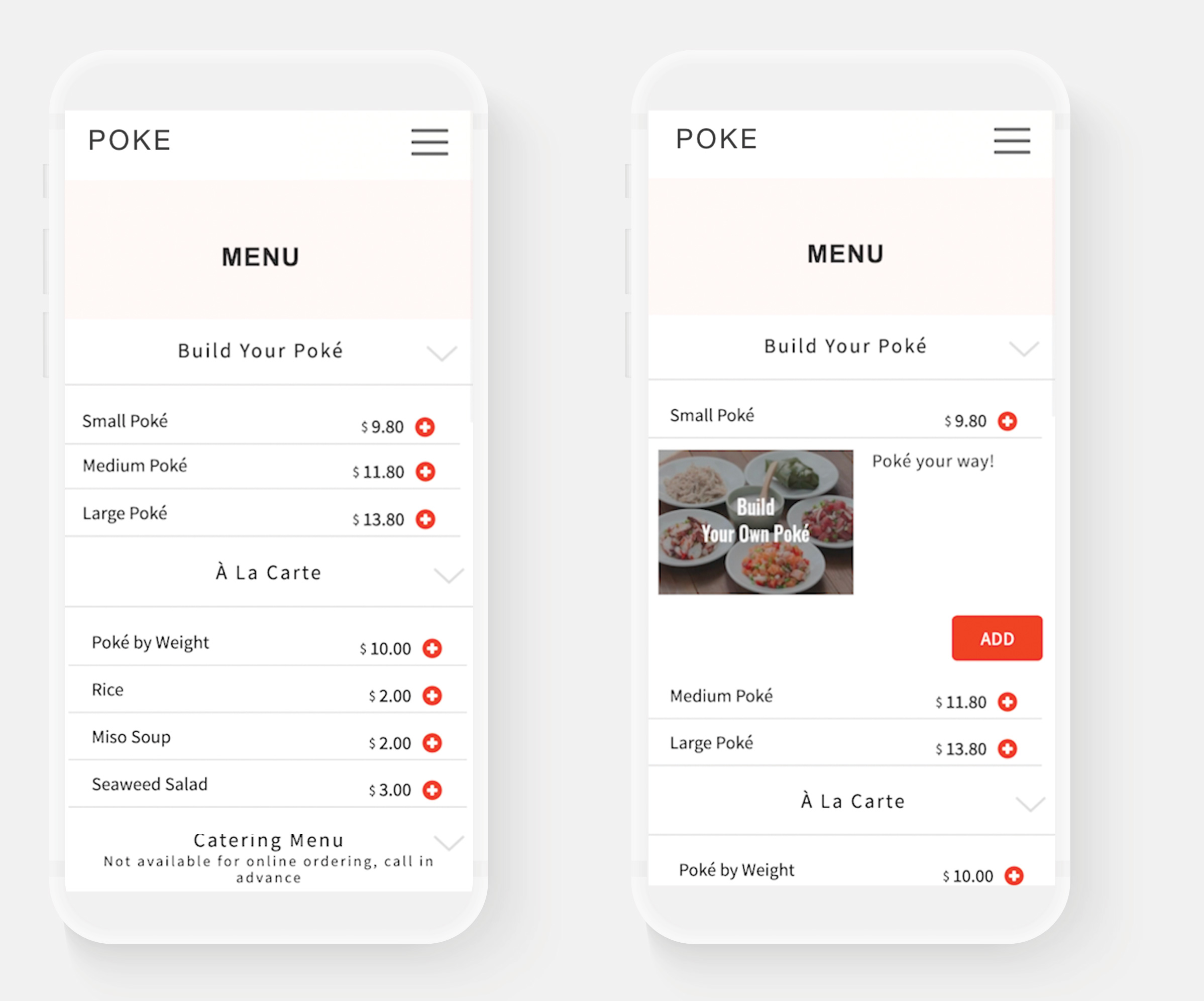
2. Inconvenience of going through a two-tap process to add a menu to the cart
1) Tap on the menu 2) Add button comes out and you can add menu
Before
Solution
Created button styles and guidelines according to the importance and applied them to the entire UI.
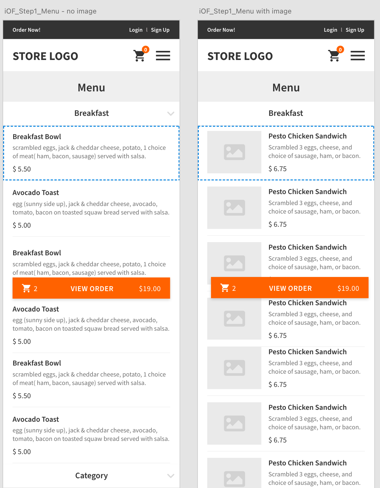
그전에는 메뉴를 두번탭해서 들어가는 구조에서 메뉴바전체를 버튼의 구조로 바꾸었고 메뉴의 어떤 부분을 클릭하더라도 바로 프리퍼런스를 고를수있고 고른후에는 카트로 들어갈수 있도록 수정하였다.
Change the entire menu bar to a button by inducing a pop-up to choose a preference no matter where one menu tab section is selected,
The problem in the old UI, when double-clicking the menu was added, was resolved and the design was changed the more intuitive way.
Menu listing Style Redesign
The Problem
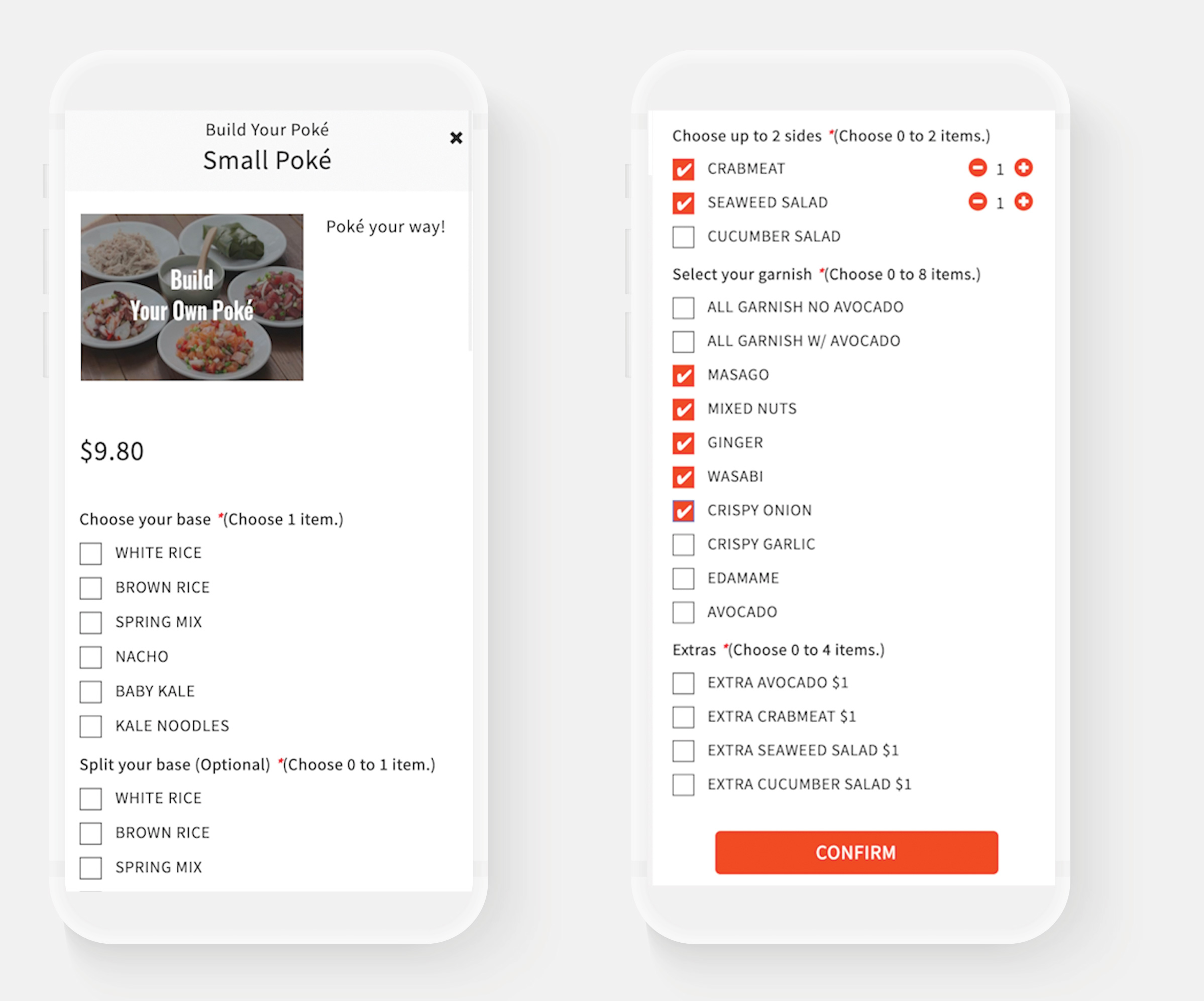
In the UI for ordering food, the details of food settings are determined according to preference selection.
Currently, there is no difference in the size of the title or the selection tool style depending on the importance of the preference pop-up window, making it inconvenient and confusing to see.
Before
Solution
Changed the button and title size according to importance, and make the difference in color. also, the current *Choose 1 item contents was changed in terms Required / Optional so that selection could be made intuitively, and the design was changed to a user-friendly UI. In addition, by adding the function of Special Comment, which was not there before, we have prepared a path to listen to additional detailed requests from customers, such as food allergies.
After

The Problem
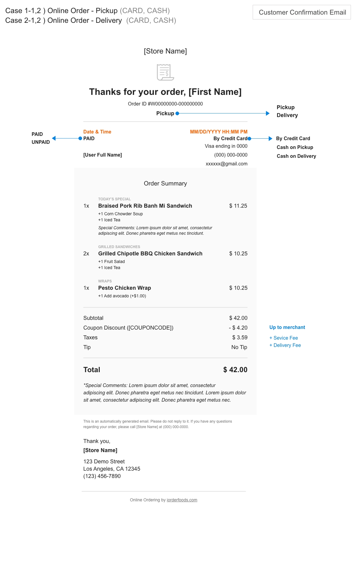
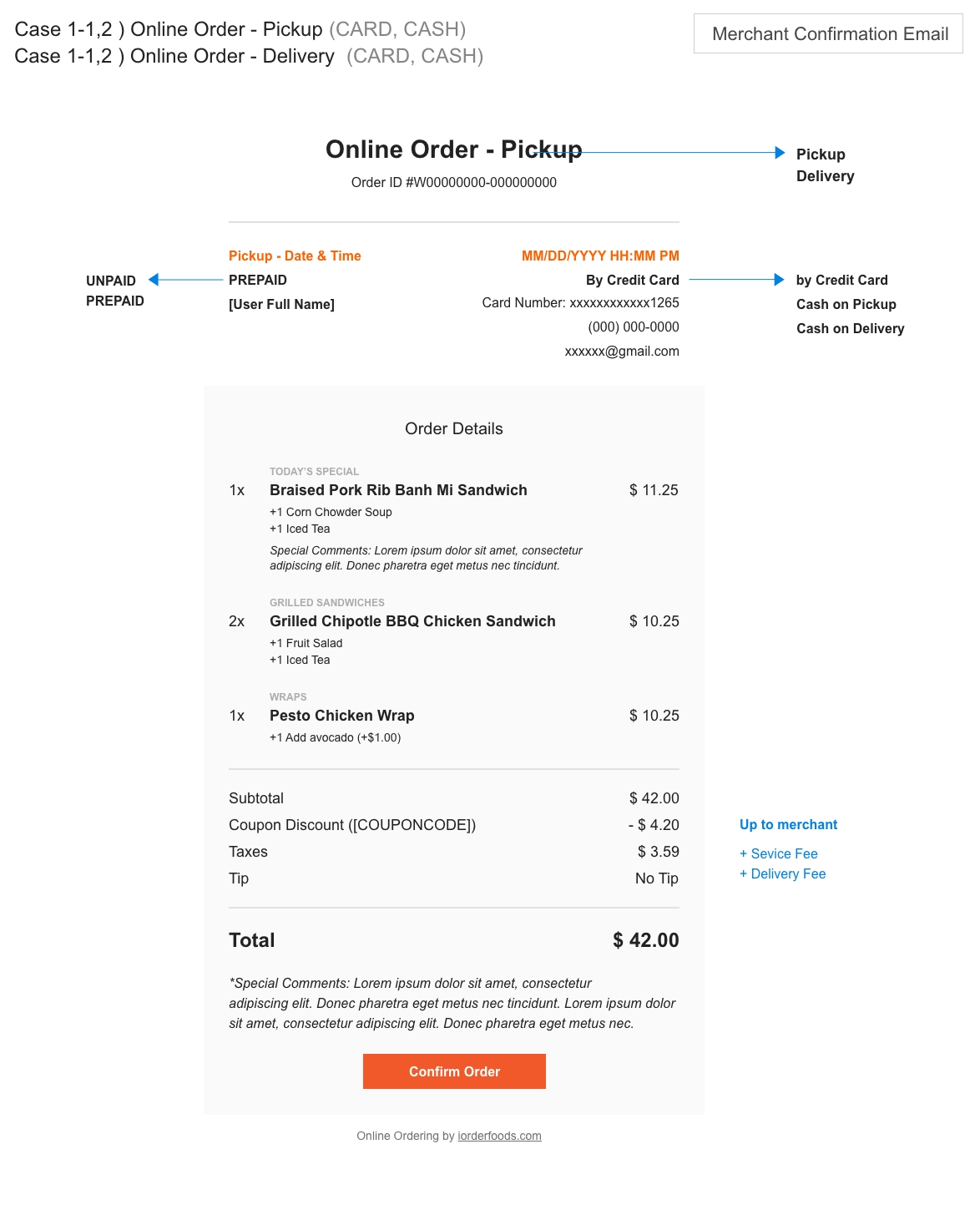
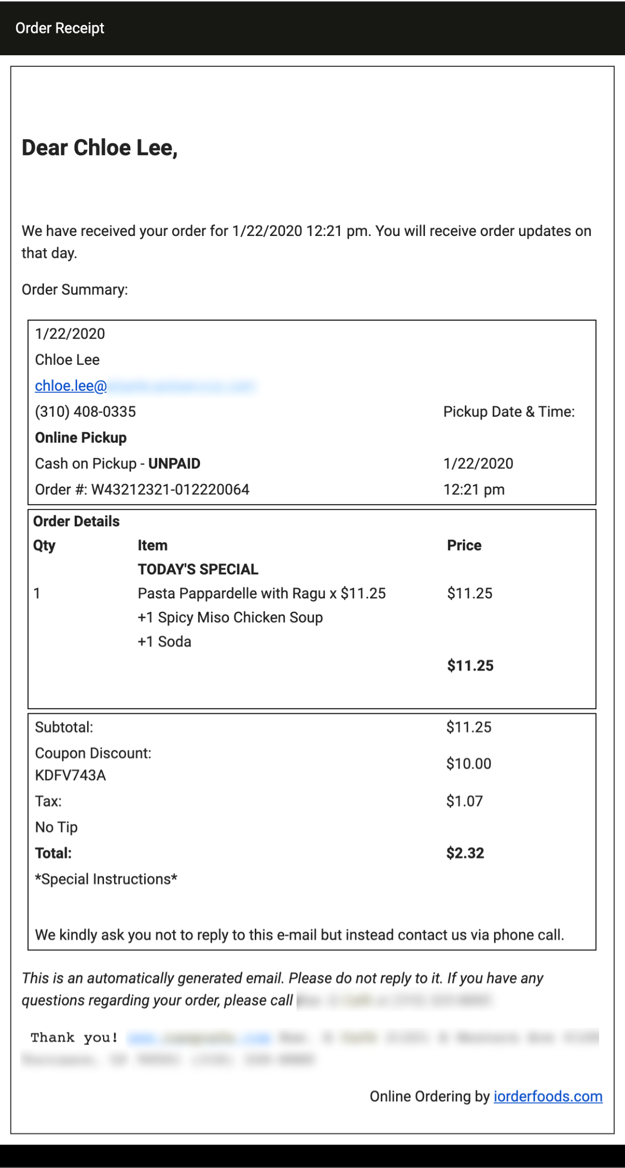
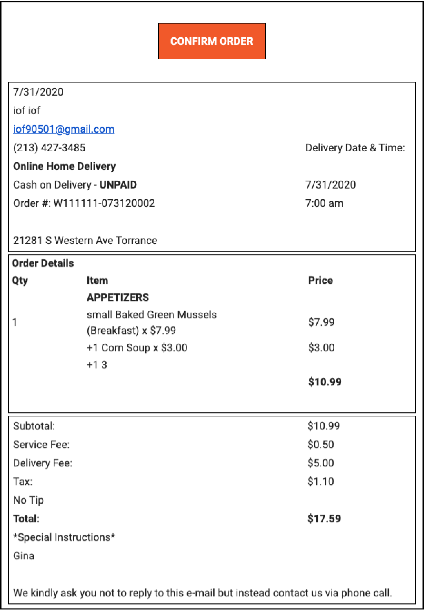
When the order is placed, an Order Confirmation email is sent to the Restaurant Owner and Customer. The current email confirmation design was designed to make it difficult to determine what was ordered and whether it was Pickup or Delivery.
Order Confirmation_email
Pickup – for Customer
Order Confirmation_email
Delivery – Merchant
Solution
The design was changed to more focused on information delivery through the contrast of the design according to the importance and the arrangement according to the theme.
Order Confirmation email redesign
