iOrderFoods
Streamlining the Online Ordering Journey

Led the end-to-end design process from uncovering usability issues to delivering high-fidelity mockups while partnering with engineers and PMs to ensure the solution met user and business goals.
Responsibilities
User Flow Redesign
User Interface Design
Prototyping & Testing
Team
2 UX UI Designers
3 Developers
1 Product manager
What is iorderfoods?
iOrderfoods provides direct online ordering for independent restaurant
Helping launch a branded Web App, customize menus and fees, and keep margins for merchants
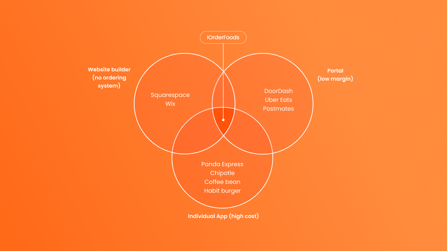
IOrderFoods differentiates itself as a competitively priced, purpose-built online-ordering platform unlike generic site builders (e.g.Squarepace and Wix) or commission-taking delivery portals (e.g.Doordash) by letting restaurants control their own fees, avoid third-party commissions, and deliver fast, easy direct ordering that lifts small-business margins.
Problem space
Even though the service itself was great, the business struggled to succeed.
The platform wasn’t optimized for mobile, resulting in a frustrating experience on small screens.
In addition, the online ordering process was overly complex and unintuitive, leading to user drop-off and an overall poor experience.
Goals
We aimed to redesign the platform to deliver a seamless mobile experience and simplify the online ordering flow
and making it more intuitive, efficient, and enjoyable for users, while driving higher completion rates and greater customer satisfaction.
User Research
Mobile users frequently reported frustration:
• They couldn’t easily confirm whether an item was successfully added.
• They had trouble tracking how many items were in the cart.
• People felt lost after the first interaction and exit the process.
Key Findings
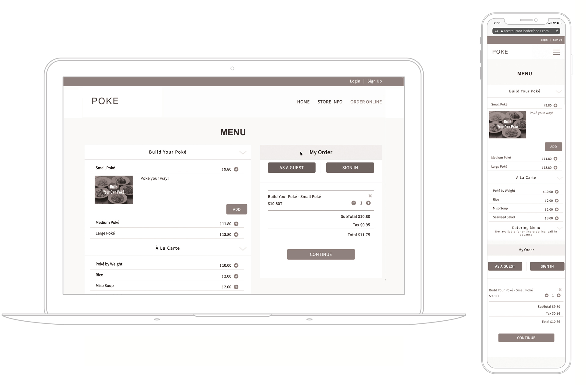
On mobile, the Menu, Login, and Cart were all squeezed into one page, since the original design was carried over from desktop. As a result, when users added an item to the cart, they couldn’t immediately see it. Instead, they had to scroll all the way down to the bottom of the page to check their cart and proceed with payment.
During usability testing, we also observed that many users didn’t even realize their item had been added. They kept pressing the Add button again and again, which ended up putting multiple items in the cart by mistake. which unintentionally added multiple items to the cart.
Approach
To solve these issues, we redesigned the mobile experience to make the cart more visible, reduce cognitive overload, and guide users through a clearer journey.
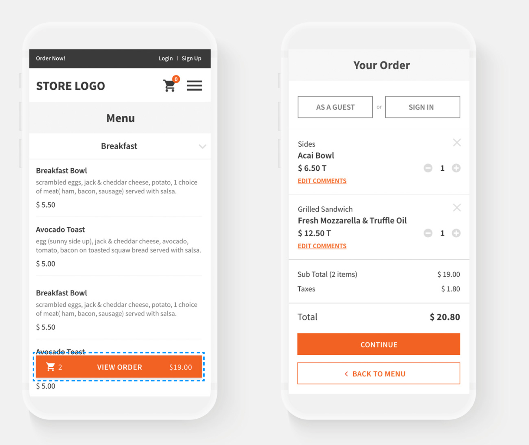
• Persistent Cart Floating Button: Introduced a floating cart button at the bottom of the screen, allowing users to immediately confirm when an item was added.
• Real-Time Updates (Counter + Price): Displayed both the item count and total price in real time, so users could instantly track what was in their cart without scrolling.
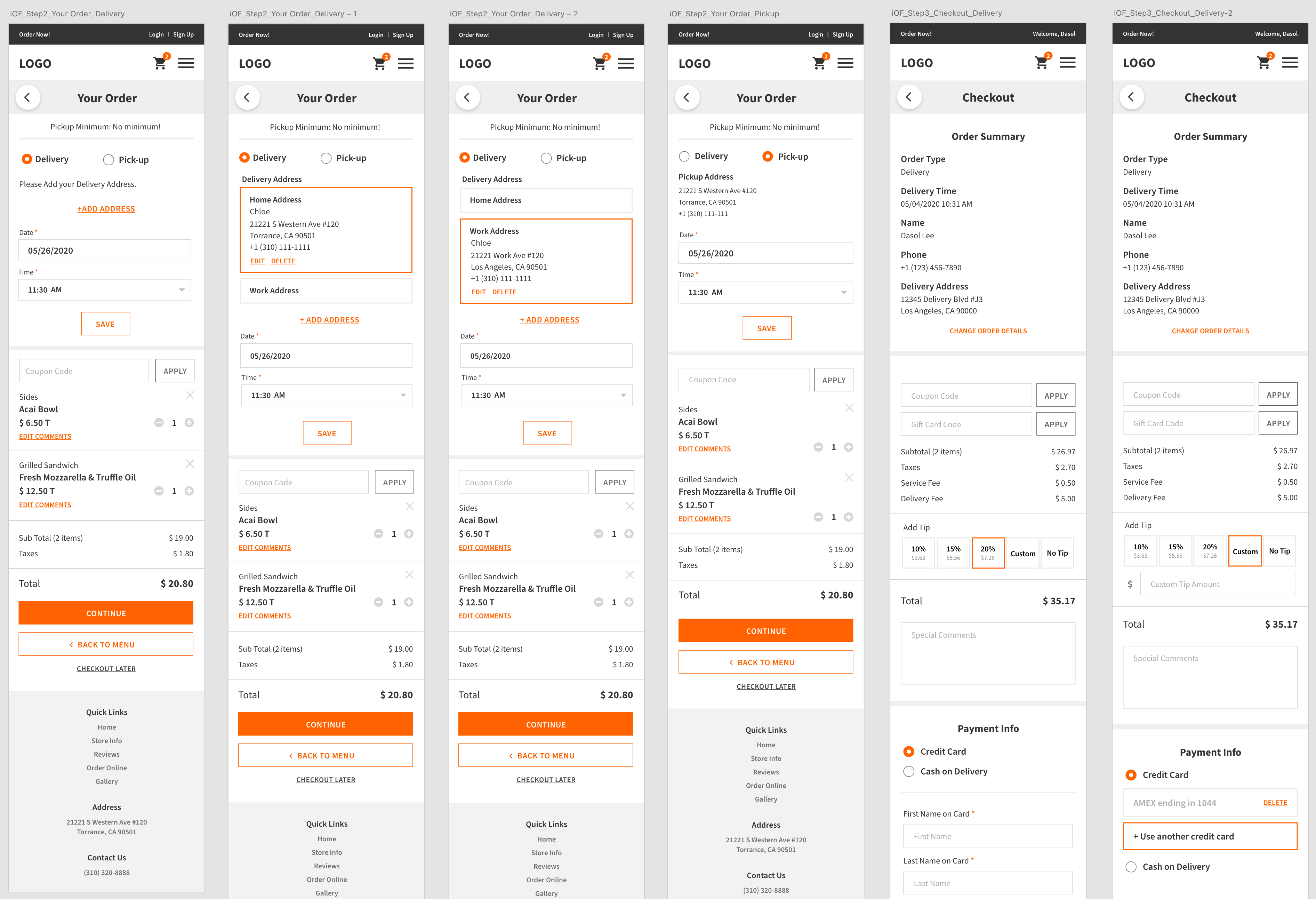
• Simplified Flow: Instead of cramming Menu, Login, and Cart into one page, we separated the journey into three clear steps. This reduced content heaviness and cognitive overload, making the process easier to follow.
Intuitive Flow
To address the issue of having the menu, login, and my order (shopping cart) pages all on one screen, we separated the steps to guide users through tasks step-by-step, thereby reducing cognitive load.


Task 1. Convenient Transition from Menu to Cart
By adding the [ View Order ] button, we created a path that can move from the menu page to the cart page at any time.

Task 2. Menu Listing Style Redesign
The inconvenience of going through a two-tap process to add an item to the cart.
1) Tap on the menu 2) Add button appears out and you can add menu

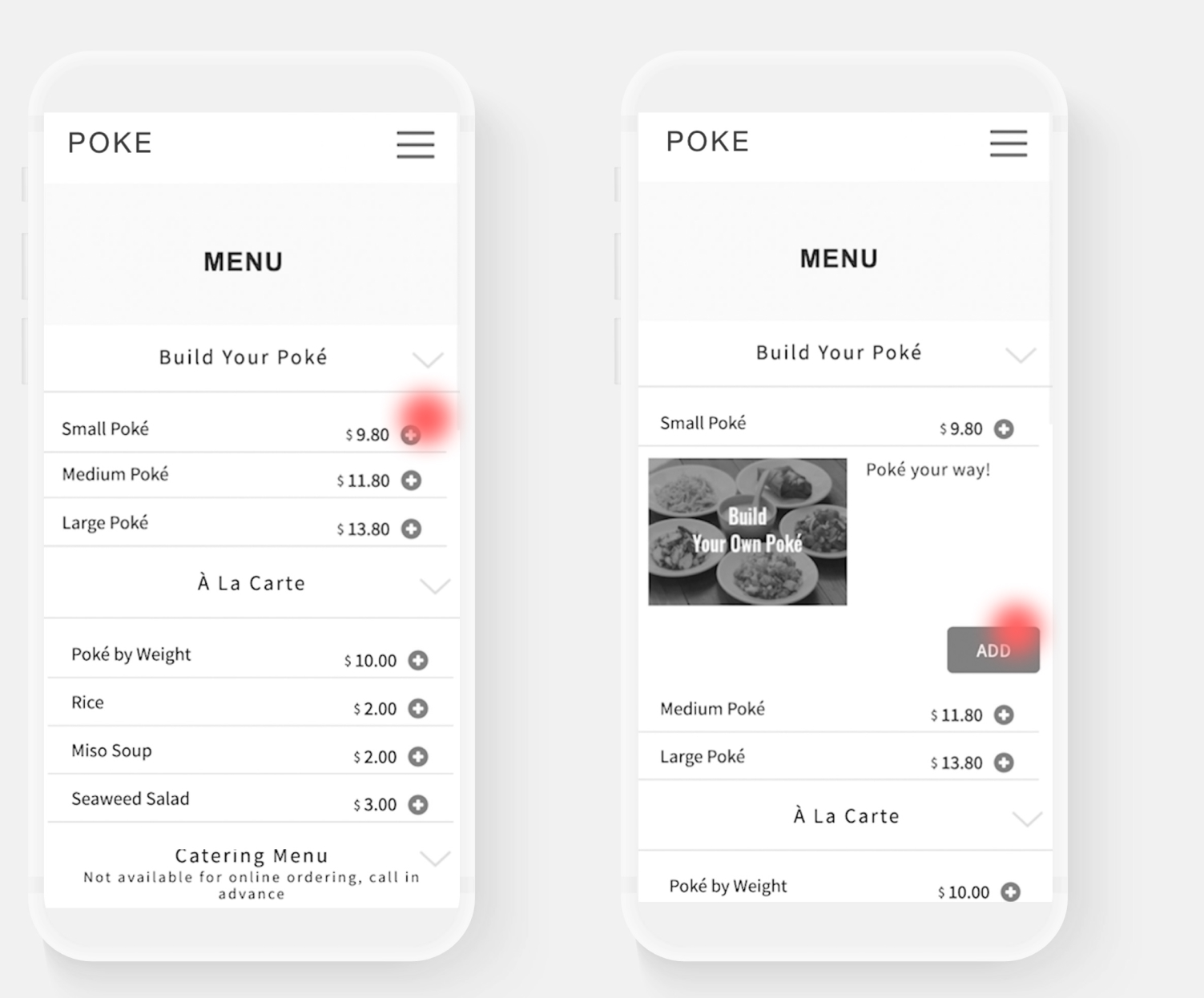
Changed the entire menu bar to a button structure and incorporated a pop-up to choose preferences regardless of which menu section is selected. This resolved the issue in the old UI of needing to double-step to add menu items, resulting in a more intuitive design.


Task 3. Preference Popup Redesign
Currently, there is no difference in the size of the titles or the style of the selection tool options, making it inconvenient and confusing to see. Additionally, there is no function to receive comments for additional detailed requests from customers, such as food allergies.

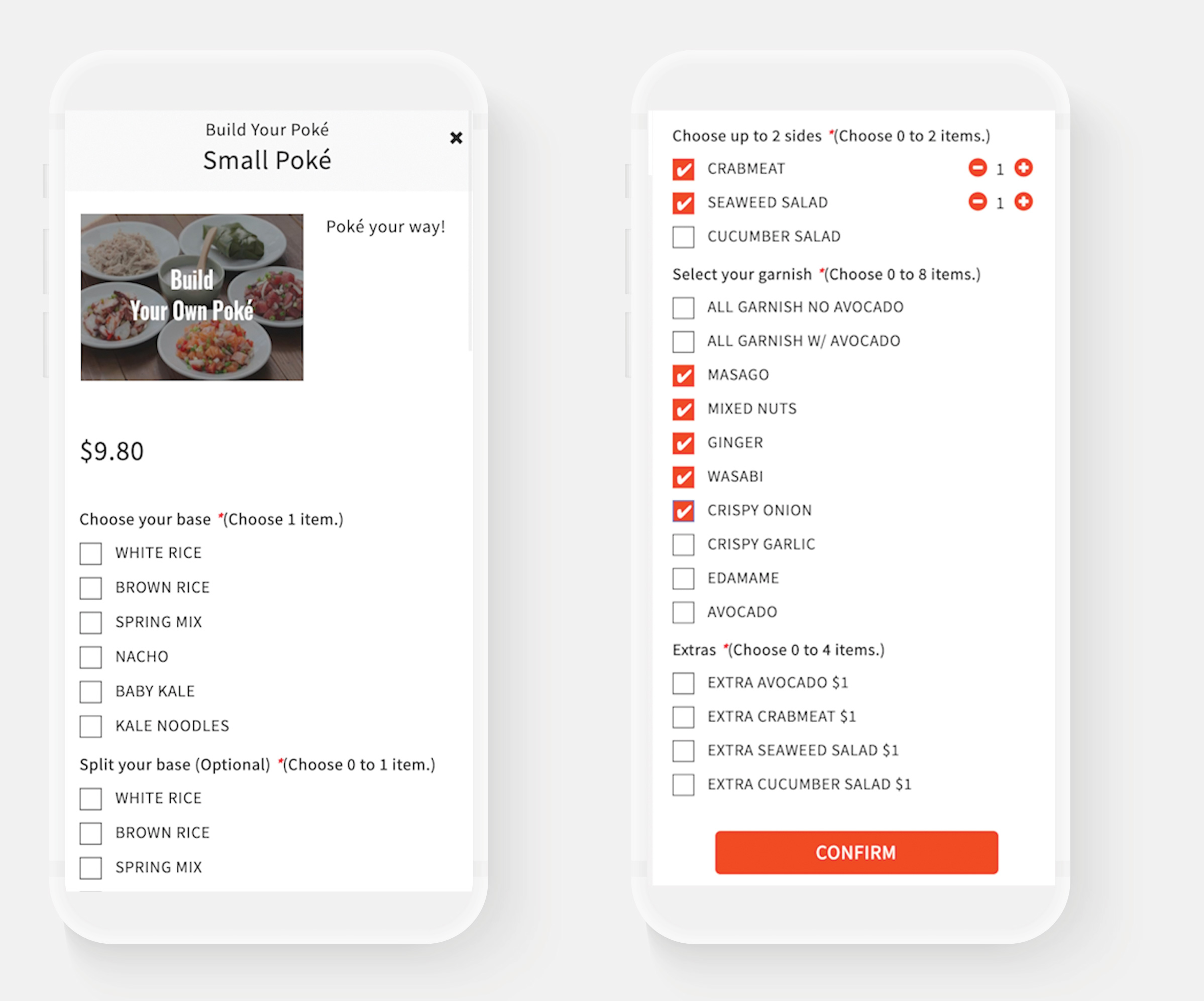
Adjusted the button and title sizes based on their importance and differentiated them by color. Additionally, we changed the current “*Choose 1 item” format to “Required / Optional” to facilitate more intuitive selection, resulting in a more user-friendly UI. Furthermore, we added a “Special Comment” feature to allow customers to provide detailed requests, such as food allergies.


Task 4. Checkout Process Redesign

